Lounge Review: American Airlines Flagship Lounge LHR Terminal 3
Up next in the reviews of Heathrow Terminal 3 lounges is the American Airlines Flagship Lounge. To save you some time, I don’t know why you would come to this lounge unless for some reason you need really fast wifi.
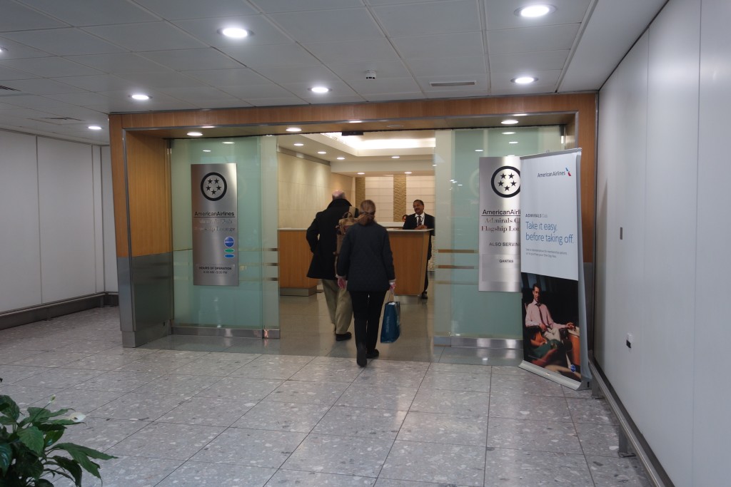
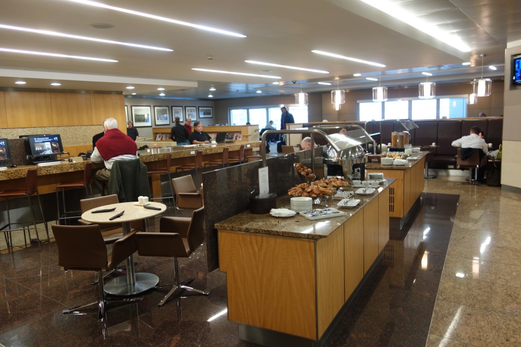
Honestly, I found this lounge depressing after visiting the Cathay Pacific lounge. The lounge looks old and tired and the lighting doesn’t help. It’s a pretty sizable lounge, but there are also a lot more people, so it feels crowded. What I don’t understand is why so many people come to this lounge because having access to this lounge means you also have access to the British Airways and Cathay Pacific lounges.
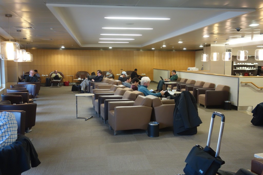
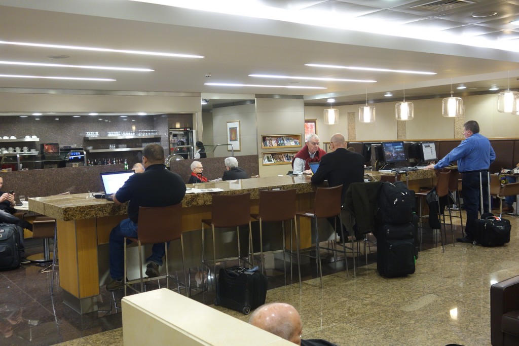
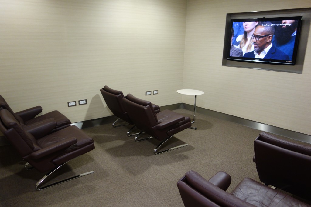
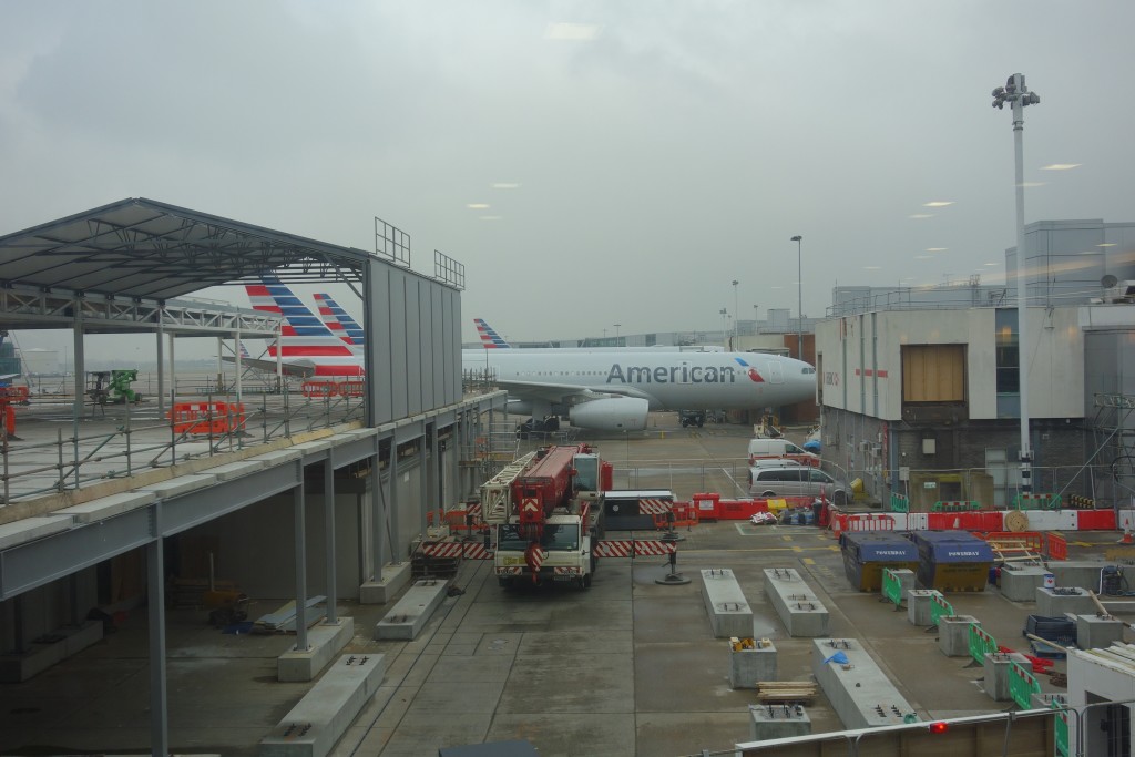
One benefit of this lounge is that you can stare at American planes from the lounge. And I admit, I do enjoy the AA paint job. There’s also plenty of seating and plenty of outlets, and the outlets are American-style, so you don’t need an adapter for your electronics. The wifi is also blazingly fast for an airport lounge (8.5 Mbps down, 5 up), so this lounge could be good for getting work done.
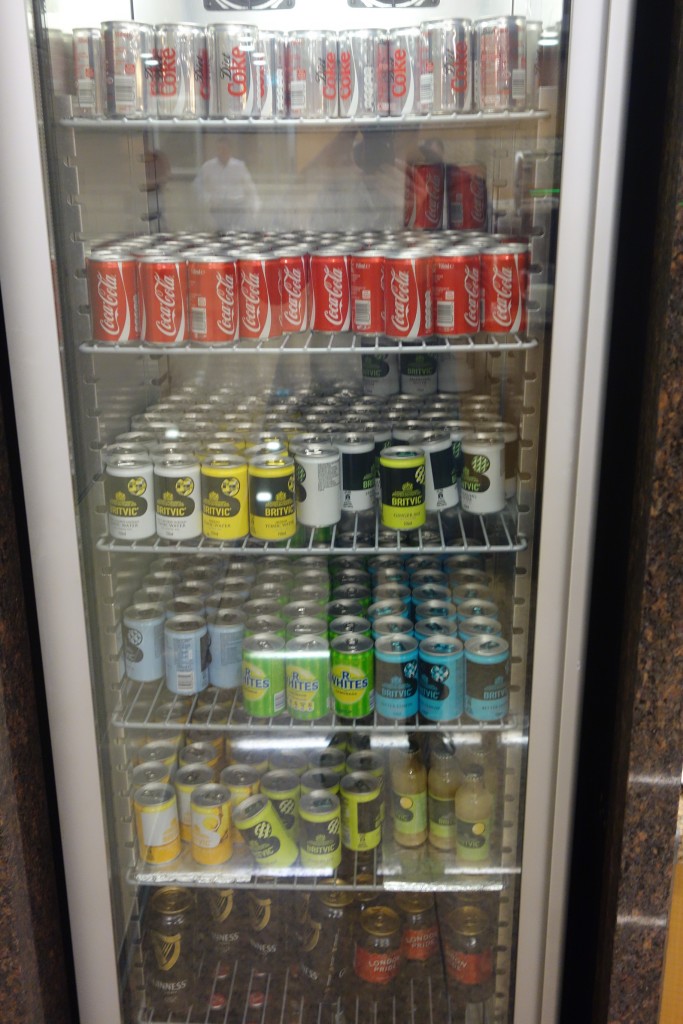

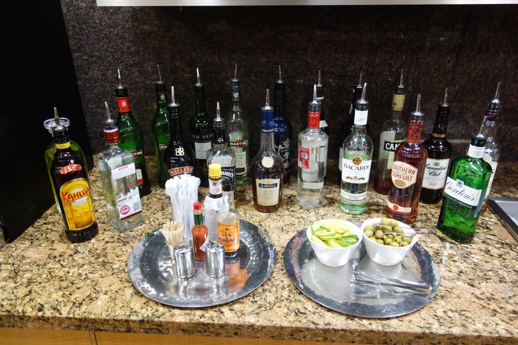
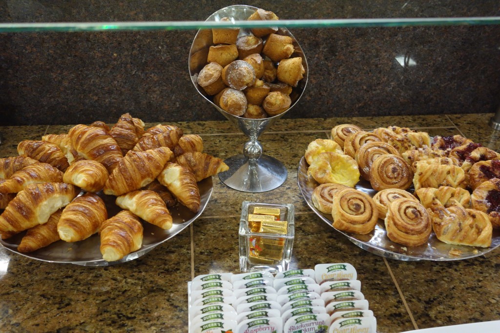
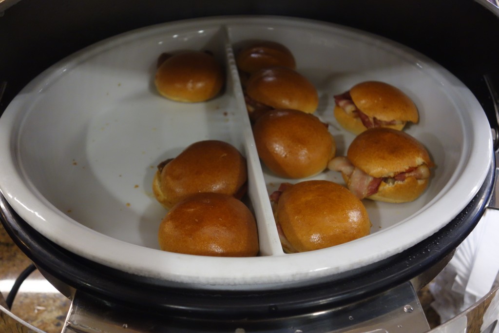
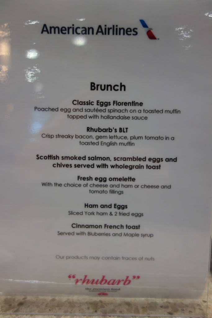
I like food, and the food in this lounge just seems more meager and less appealing than the food in either the Cathay or BA lounges. They do have a made-to-order menu, but I happened to arrive when they were switching menus, so I can’t comment on the quality of that food. They also have mini muffins for breakfast, which I did not see in the Cathay lounge.


Overall, I found this lounge to be a bit depressing. There’s really not much of a reason to come to this lounge when you have better options so close by.
I was just in this lounge last week around noon or so. It was very nice. Sure the food offerings are average but it is fairly quiet and I don’t usually find it all that crowded compared to the much more awesome BA lounges at LHR. BA beats AA with drink and food for sure. I guess it depends what your after I guess.
You’re right; the lounge is depressingly, boring. The different “marble”-styled floors and counter-tops at least make it seem like they tried to make it somewhat nice. In reality, the design has so much cacophony.
Basically…..American Airlines threw up in their own lounge. My apologies if the imagery is too much.
Wow, the United Club at T2 puts that place to shame.